
Aero Page Builder
The page builder your editors will actually use
Fifteen components. One field vocabulary. The tagged 2.1.0 product — not a parallel skin. Editors compose pages in Drupal; agencies ship the same modules to client sites.
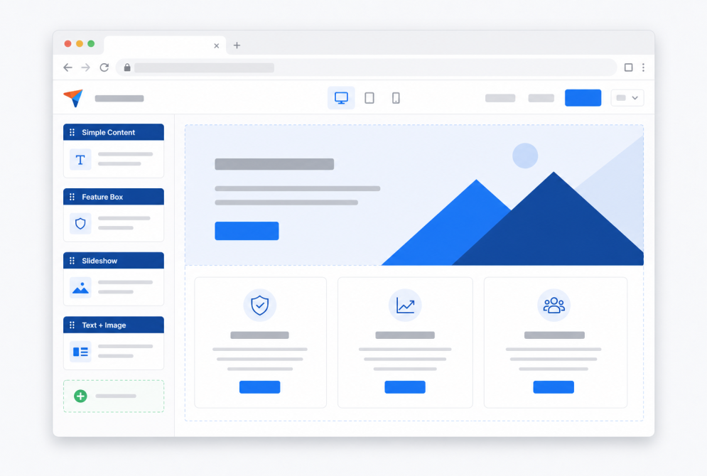
Build at the speed of done
The whole pitch in three verbs. Everything else on this page is a live APB component, not a mockup.
Editors assemble pages from components that already know how to look right. Add one, fill in the fields, publish. No ticket to restyle a gallery.
Every accordion, profile, and gallery is structured content sharing one field vocabulary. Restyle a component once and every page that uses it follows.
The same tagged modules go to client sites through Composer. This demo is not a parallel universe — it is the product, frozen at 2.1.0 for documentation.
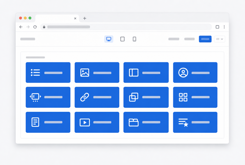
Build with a component
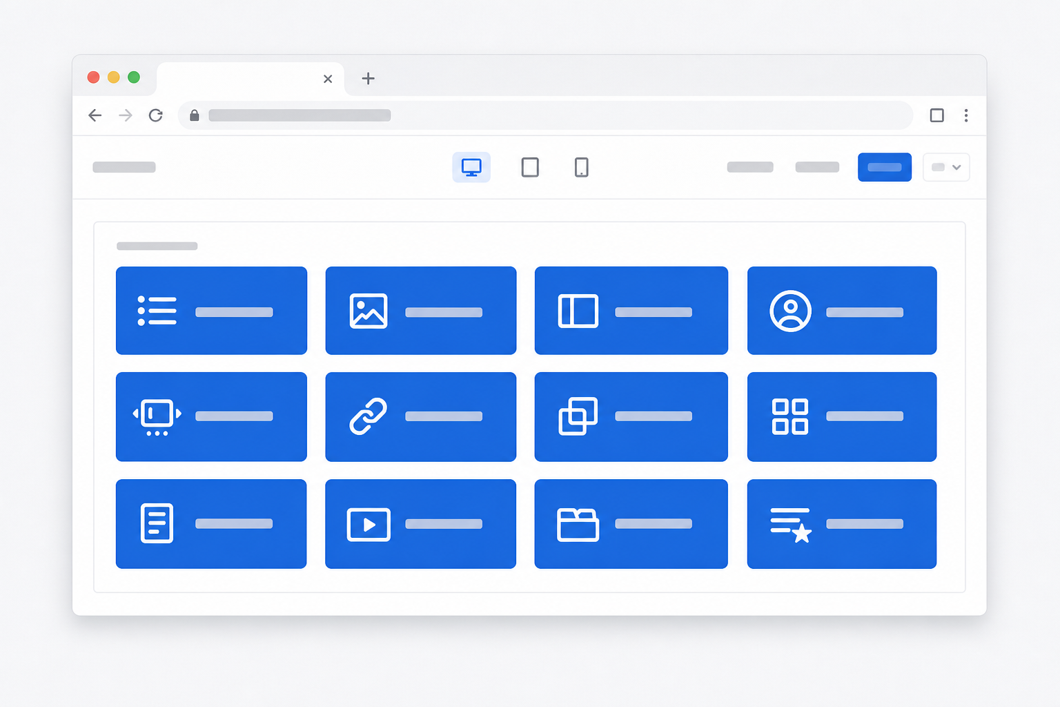
Jump in by picking Accordion, Feature box, Slideshow, or any of the other twelve. They share width, columns, color style, and intro — learn one and the next feels familiar.
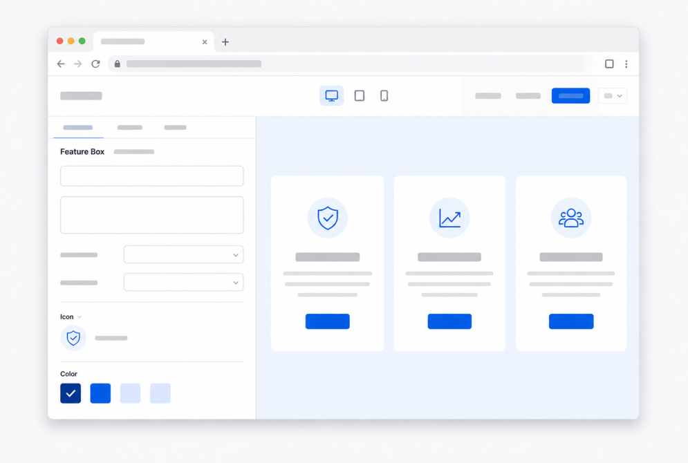
Configure in place
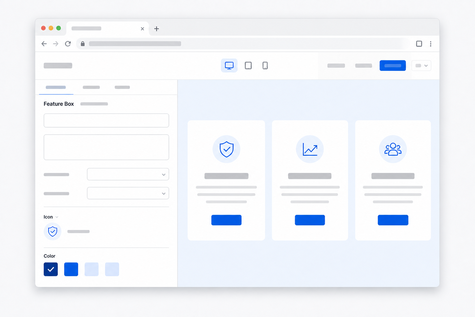
Inline Entity Form, not a separate layout canvas. Fill the fields, pick a color style, set target placement, publish. The front end reads those fields — it does not scrape hidden markup.
Publish the page
Twig plus the APB runtime. Target placement moves a hero into the top region; container settings paint the band. Editors do not wait on a ticket to restyle a gallery.

A closer look
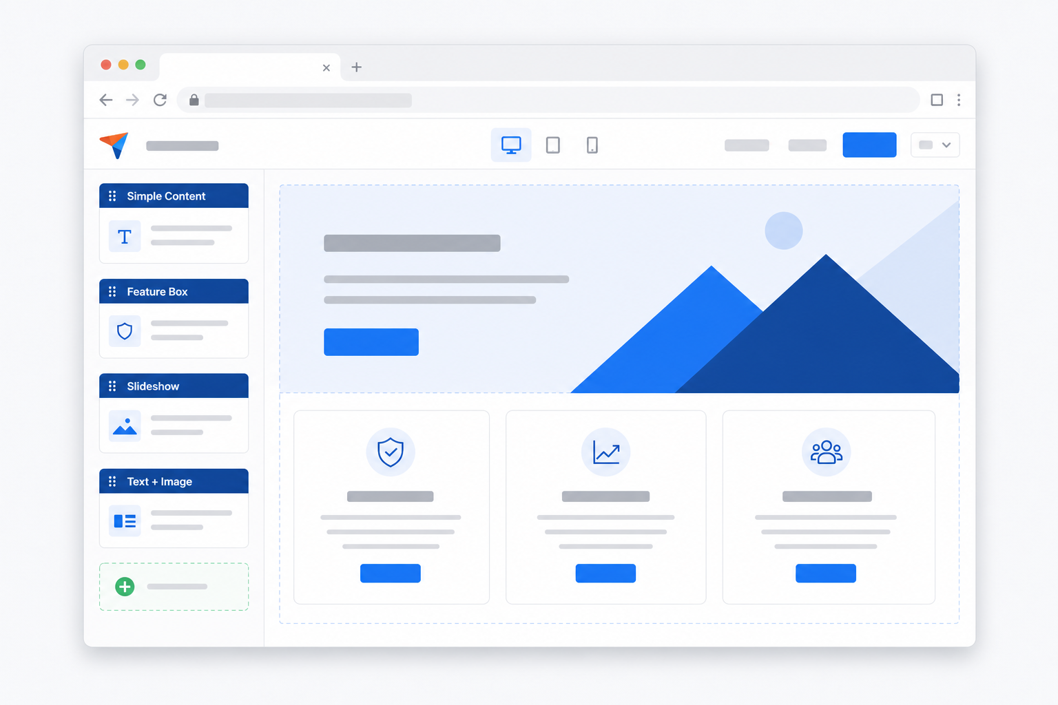
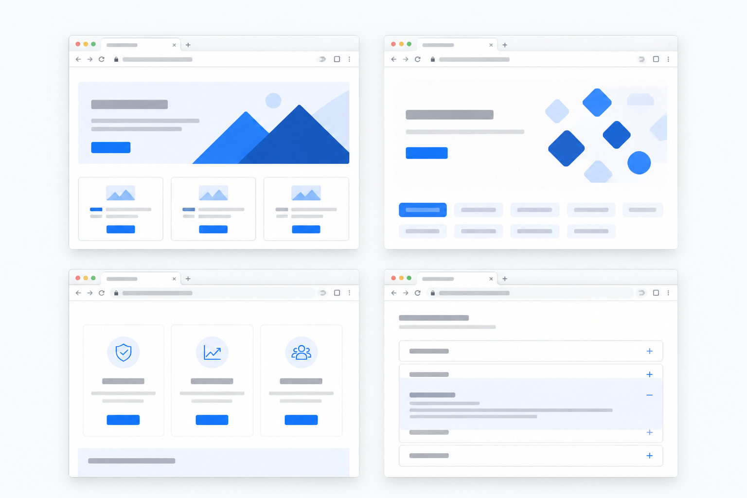
Marketing art generated for this homepage, used by Slideshow-adjacent Simple Content, Feature box, gallery, and Links — the same image fields an editor would fill.

Ready to build on components you own?
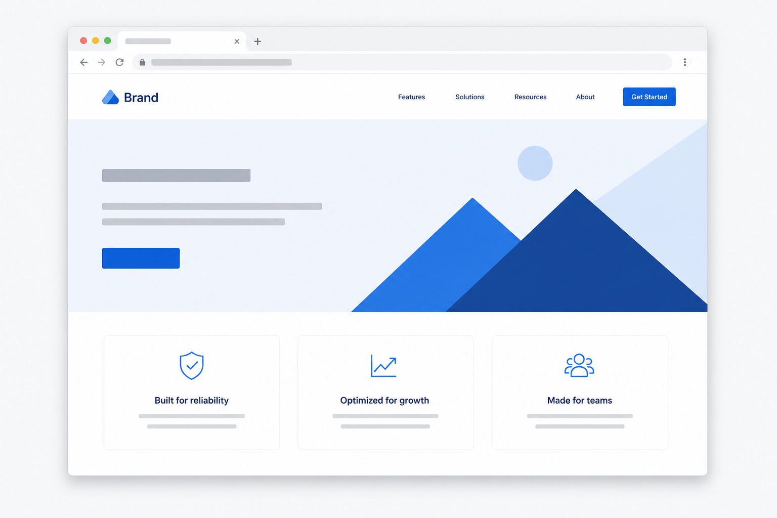
This homepage is itself an APB page: Simple Content, Feature box, Image gallery, Links, and Accordion.
The frozen example pages we record documentation against. Accordion, Profiles, Views, and the rest.
Walk the product with us. We would rather do that than send a PDF.
Questions we hear before a kickoff
Because the pages are entities, the components are modules, and the design language is a field vocabulary — not a page-builder blob. That is what survives a redesign.
Hosted builders are fast on day one and expensive on day four hundred. APB ships as Composer packages you keep. The demo at 2.1.0 is the same code a client site will run.
Add a paragraph. Pick a component. Fill the fields. Target placement moves a hero into the top region when the theme exposes that ID. Publish.
Each parent component can stay in the body or move to a named slot — Top region, sidebars, main content. The theme provides the IDs; core JS does the move. Missing IDs keep the paragraph hidden, on purpose.
Both. The example pages are frozen so recordings stay honest. The modules are the tagged 2.1.0 release.
Ready to build smarter, faster pages?
See how editors compose with components they already understand — then ship the same modules to the next site.